Husky Mask Exchange (Best Design Award)
Husky Mask Exchange is a group research project in the Human-Computer Interaction Capstone supervised by Professor Katharina Reinecke. We designed a system that fosters virtual and physical connections, bridges different cultures, and facilitates communications within the UW community under the pandemic by exchanging homemade masks with paired partners. The purpose of this project is to fulfill the need for PPE and provide a way for users to connect with other individuals in the community based on similar interests. The entire project is based on React, React Native, JavaScript, CSS. We conducted various user research, including contextual inquiries, participatory design and semi-structured interviews to find insights that drive the design and implementation of our project. We also conducted multiple usability testing to make sure the product is making sense to our target users.
Our poster 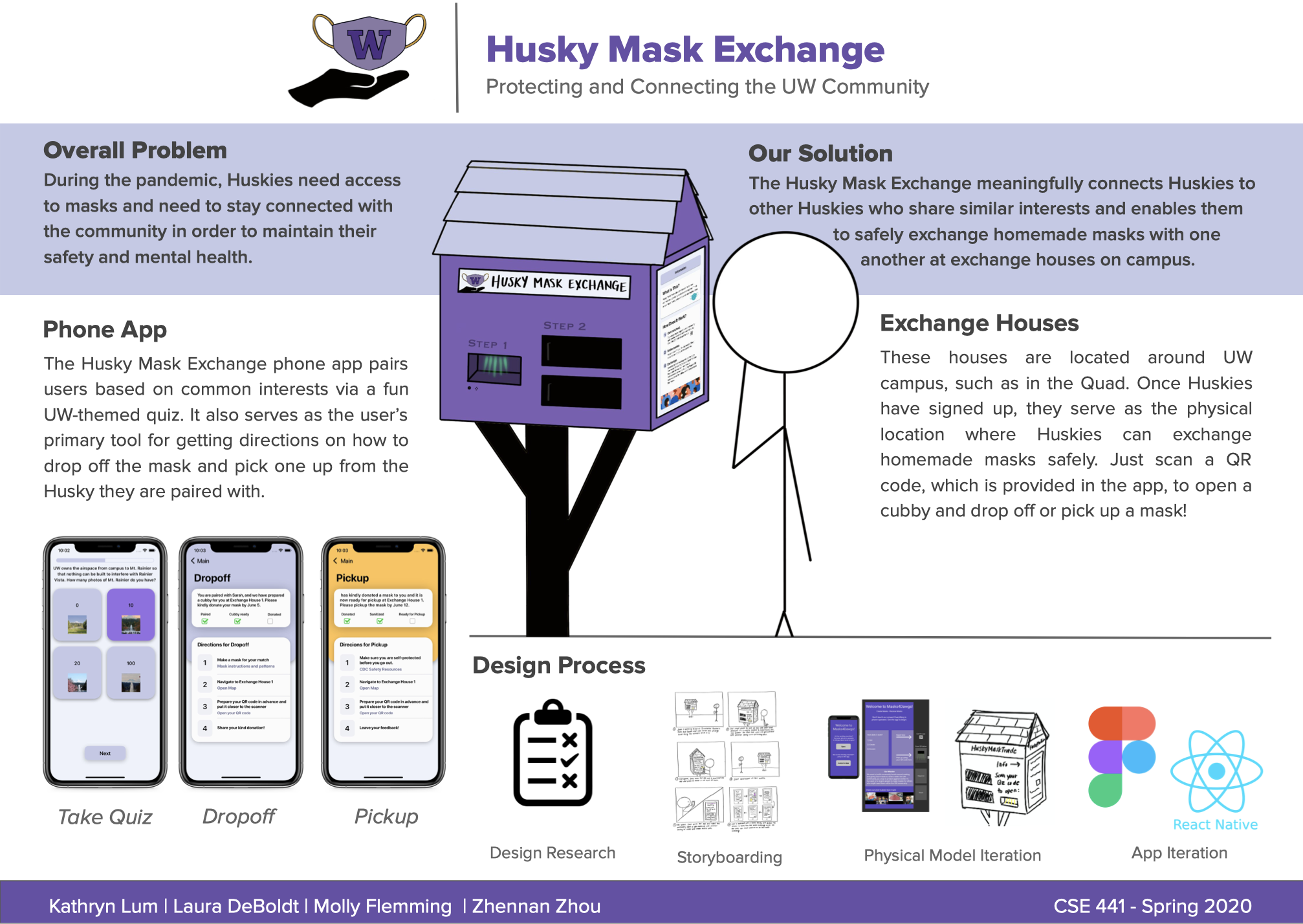
Duration: 2020.04-2020.06 (11 weeks)
My Role: In charge of user research, usability testing and designing the product architecture, user flow and user interfaces.
Methods: AEIOU Framework, Contextual Inquiry, Task Analysis, Usability Testing, Heuristic Evaluation
Tools: Figma, React, React Native, CSS, Expo, Git
Project also credits to Kathryn Lum, Laura DeBoldt and Molly Flemming.
Overview
We asked, and Huskies are feeling disconnected from each other. The global pandemic has caused nearly all social contact to stop, and everyone is nervous to go outside without PPEs. How can Huskies maintain their connection with the UW community while still being safe? We designed the Husky Mask Exchange. You’ll be able to find these stations across the UW campus, where a quick QR code scan lets you download our app and get started. Functioning like the “neighborhood libraries” that allow people to trade books, these stations let Huskies exchange masks with one another in a safe and personal way. Users are paired via a fun, UW-themed quiz, and then get directions on how to make and receive a mask from their new UW connection.
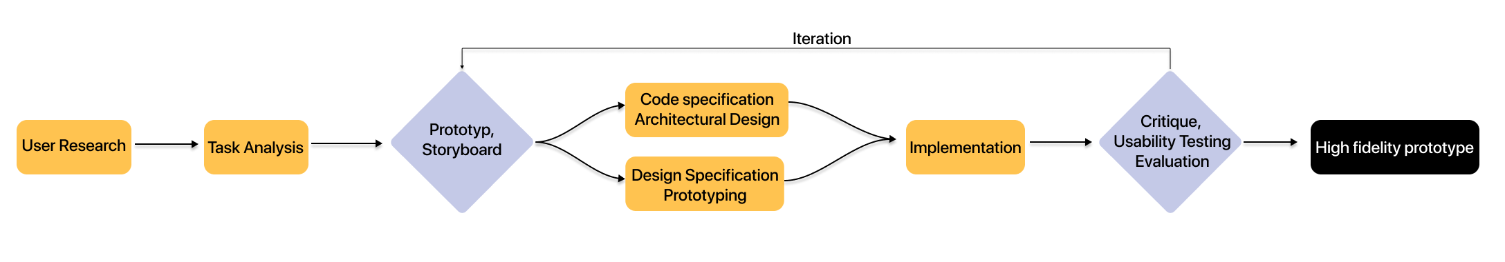
Design Process
Throughout the 11-week project timeline, my team and my structured our research, design and build process following the iterative design process.
User Research
In the very early stage, the team was focusing on distributing and exchanging masks via vending machines. In order to understand our target audience better, the team set out to conduct various user research, using semi-structured interviews, participatory design method, surveys based on Activities, Environments, Interactions, Objects, Users framework.
Initial User Research Findings
After analyzing our user research results and feedback from the teaching team and other students in the class, we have compiled the following 5 primary findings:
- It addresses people’s the need for masks under the current situation
- It provides a way for UW community members to help those medical workers, practitioners, doctors on front lines, both mentally and practically.
- The mask represents a more tangible physical touch to frontline health care workers than plain emails, letters
- The connection to the UW community needs to be stronger and its application after COVID is less promising.
- Less feasible considering the time frame and technical possibility
Changing Topic
In order to tackle issues we found during user research and critique, we decided the steer our course, simplifying our ideas and design while strengthening the connections within the UW community. We followed the same procedure above and conducted a variety of user research and in-class design critiques. One of the main findings we drew from user research is people hope to receive something physical and personal during this unusual time. The overall result from our user research was constructive and promising enough that we could continue to refine this idea.
Task Analysis
Based on the insights from user research, we listed out several main tasks that embody the objectives our target audience want to achieve:
- Task1: Be able to login to the mask exchange system and paired with someone by taking a UW-themed quiz
The majority of our interviewees told us that they want to pair with someone who they can trust and someone who shares something in common with them.
- Task2: Drop off masks to paired partner via individual QR Code
- Task3: Pick up masks from paired partner via QR Code
Task 2 and 3 are the main tasks we plan to support because they are at the core of the mask exchange process that bridges virtual connections within the UW community.
- Task4: Give feedback on their mask quality, show gratitude, etc.
We discover that even though we limit the users to UW community members to keep the mask exchange quality, we still need some mechanism to hold participants accountable. In doing so, everything could prepare a mask for their paired partner wholeheartedly.
Design and Code Specification
Following our design visions as well as targeted primary tasks, we designed the following code specification that serves as the main guideline for the team in the future implementation. 
Design Architecture
Following the storyboard, we designed the product’s architecture, which serves as the foundational blueprint for the following implementation. 
Prototype
We designed our initial low-fidelity prototype in Figma. This low-fidelity design functions as a prototype that is sketchy in design but full-fledged enough in representing our main ideas in the Wizard of Oz session. We incrementally moved toward the final high-fidelity prototype through continuous refining and adjustment on the ground of our new user research, usability testing, design critique from Professor and TAs.
Feedback from Wizard of Oz Session (Professor Audrey Desjardins and Professor Katharina Reinecke)
From the Wizard of Oz session, the team intended to learn whether or not the function and purpose of the vending machine was clear at first glance and see if the “using phone as a remote” interaction is clear and straightforward for users. The team also wanted to see if using a QR code to sync the phone and vending machine is intuitive for users, measure the length of a person’s interaction with the machine, and see if the vending machine layout was accessible. Our findings included both positive feedback and feedback suggesting we revamp our concept. In response to feedback, we will consolidate the idea of “phone as remote control” for the vending machine’s screen to take advantage of the flexibility of a bigger screen and simplify the logic to encourage more interactions. We will make the flow of interactions consistent across our phone app and vending machine to eliminate discrepancies in user experience. We will continue to pair users to make masks for each other because this is a good way to foster virtual connections within the UW community, but we are considering an auto-matching based on preferences, tastes, etc. Additionally, we will keep the QR code syncing for verification purposes because it is convenient and avoids physical contact with the vending machine under current situations. However, we are considering removing the payment aspect of the vending machine which may deter participation, but still requiring users to sign up with their Husky ID so we still connect the UW community.
Usability Testing
From our in-class usability testing session, we received a lot of useful and instructive feedback on our design and our product. We analyzed each of them and made some adjustments to our product.
We discovered that there exists a dire need within our target users to build connections with others in the community apart from simply changing masks. This prompted us to think of a way to simplify our design of the exchange house as well as the app to encourage effective connections. Following this goal and combining the idea from neighborhood libraries, we continually iterated our design, changing from vending machine to a minimal house design with 2 cubbies. Inside the app, in order to reduce distraction from navigating between screens while still providing enough support to our users, we decided to support 2 of our primary tasks identified during our user research: dropoff and pickup and then grouped all relevant information together with clear indications.
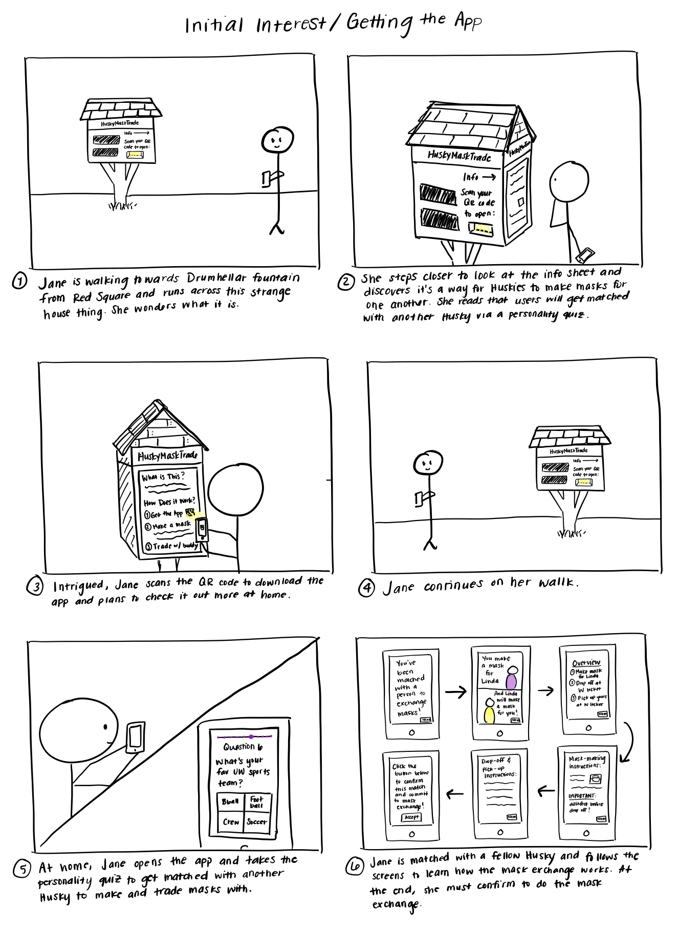
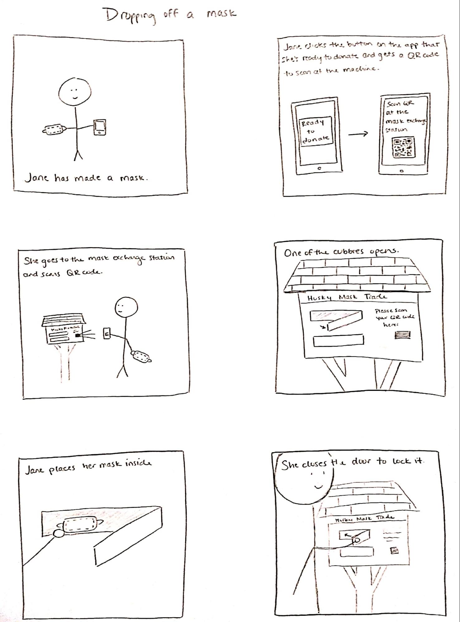
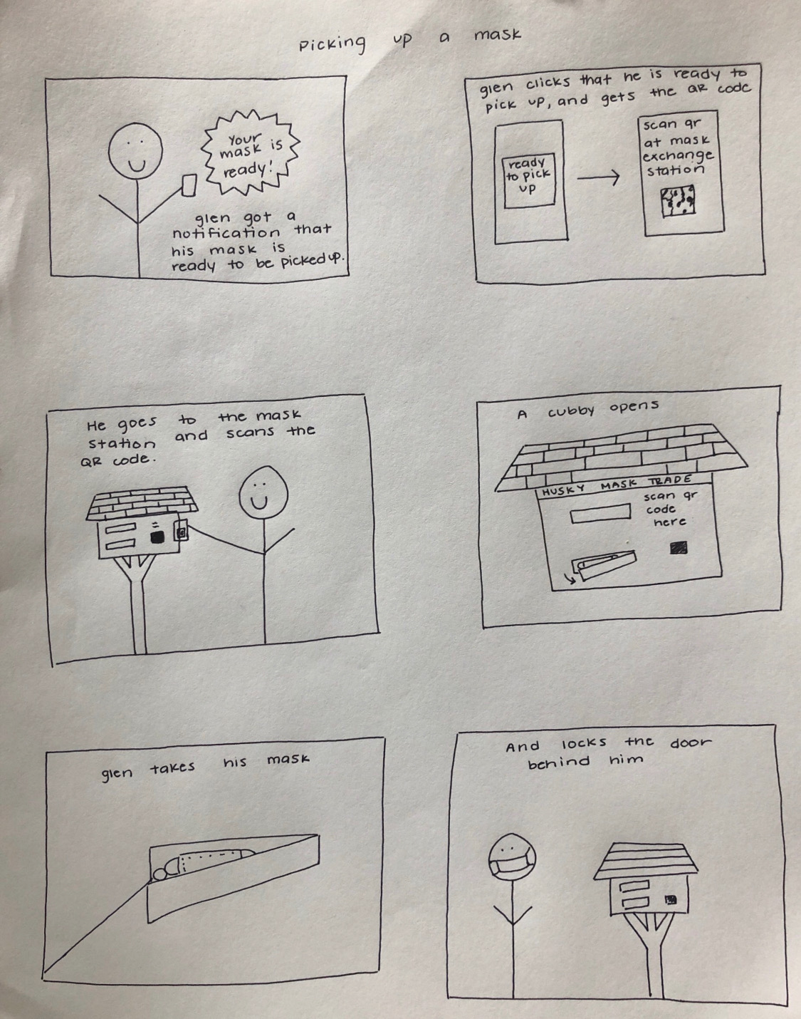
Final Storyboard
Combined usability testing and design critique, we settled down the following storyboards that address those needs.
Final Design and Implementation
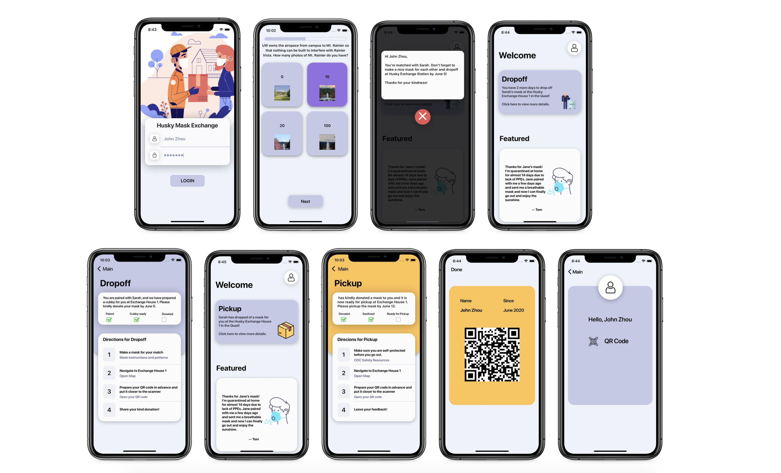
We aimed to address both of these social and health concerns in our design of the Husky Mask Exchange. The Husky Mask Exchange system is composed of two different parts: a physical exchange house and a phone app. On the right side of the exchange house, an information screen details how the mask exchange works and displays a QR code for users to download the app. On the front side, a scanner allows users to scan a QR code that they receive in the app, which opens one of the two cubbies they are assigned to. Correlated with the exchange house is the phone app. The phone app is used to pair users based on common interests surrounding UW topics, and it serves as the user’s primary tool for getting directions on how to drop off and pick up masks via the exchange house.
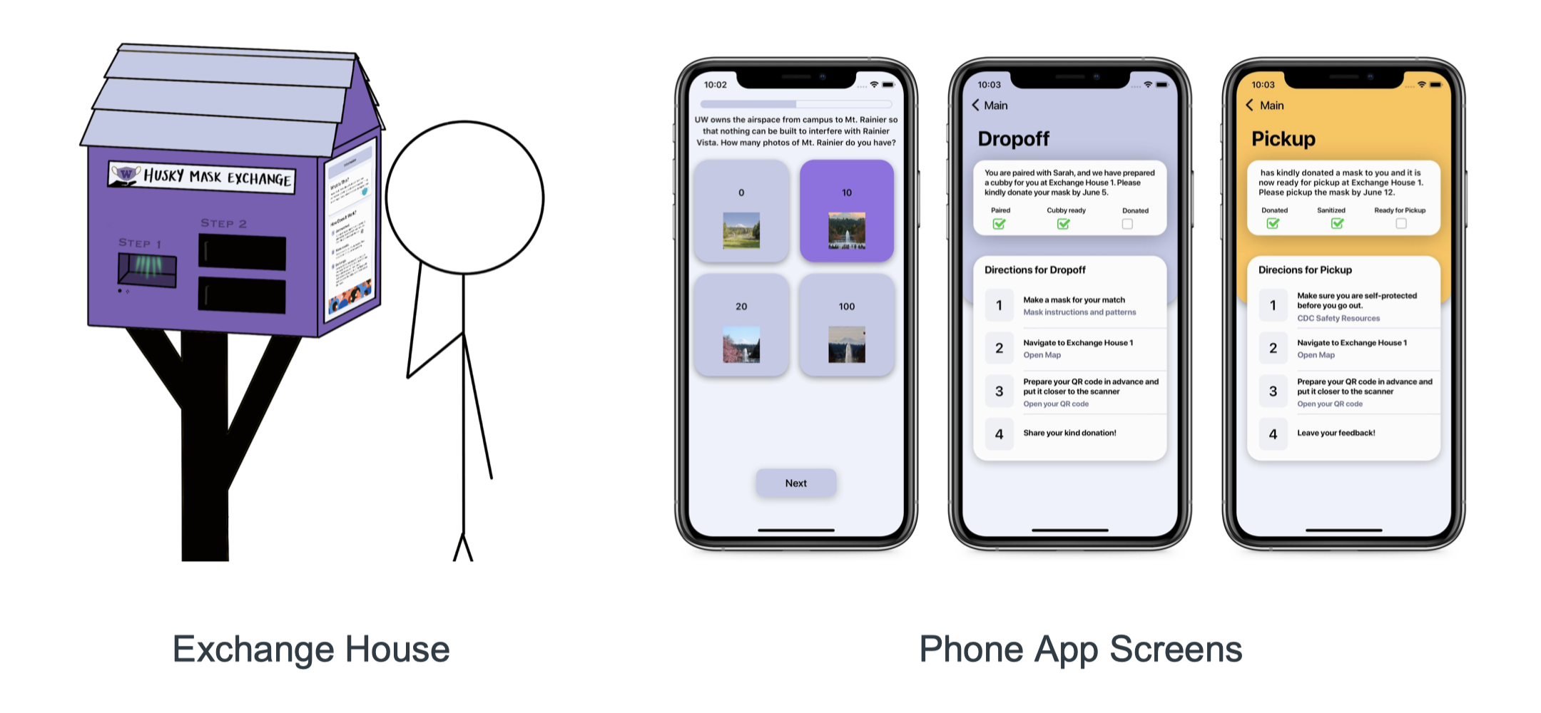
We designed this system to achieve several different things, one being safety and security. Some of the feedback we received in our user research and during early testing sessions involved concern about protecting one’s identity from people with bad intent. This pushed us to think of a way to create meaningful connections between Huskies without revealing too much of their personal information. In response, we developed the idea of creating a fun quiz, which pairs users based on their common interests relating to UW-themed topics. We also use the exchange house as a central location to exchange masks so that users do not have to share their personal addresses to send each other their masks. This way, Huskies can feel like they are connecting with someone who is similar to them without the safety concerns of divulging their personal information.
We built our digital prototype based on primarily on React Native. Based on our design prototype in Figma, we also implemented several design refinements to conform to design principals and languages on both the Android platform and iOS platform
Future Vision & Reflection
During our design process, we were able to work incrementally and constructively. Although we did not always stick to our original timeline, we did a good job of using one day a week(typically Sunday) for planning and the next several days for working, checking in every so often. The amount of design work we did in the middle of the quarter helped us especially in getting feedback about what would or would not make sense to users. Throughout the quarter, we maintained a goal to build a clean, intuitive, and most importantly user-friendly interface for both our exchange house and our app. We hoped this would minimize digital disruption during the mask exchange between two community members and allow them to understand clearly how to proceed with the exchange.
Looking back at our code and design specification, we completed most of the functional, technical, and usability requirements we set for ourselves. The parts that we chose to omit included logging in using UW’s identification system, getting a notification when your mask is ready for pickup, and adding testimonials to the information screen on the exchange house. While we felt these would all be necessary for a full-fledged version of our app, we decided to prioritize finishing other functions, and ensuring those made senses for our presentation. In our architectural design, we originally planned to have a database to keep track of user data. We ended up using a JSON file from which to pull mock data because of time constraints. We also split our app into different components to maximize code reusability. Finally, we used much of our code specification as a blueprint to get our app started, and incrementally added to it as we encountered new issues and ideas.